





Most products lose users in the small moments: a button that doesn’t confirm it was tapped, an error message that blames the user, a loading screen that just sits there. This UX micro-copy and micro-interactions guide breaks down how thoughtful words and tiny animated responses work together to make an interface feel alive, honest, and easy to trust. Follow these nine steps to turn overlooked details into real conversion gains.
1. Start With the Moment, Not the Button
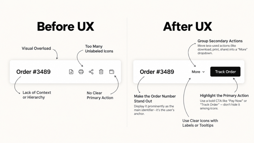
Before writing a single line of microcopy, map the moments where a user needs reassurance: submitting a form, waiting for a result, hitting an error. Good UX microcopy is written for a moment in the user’s journey, not for a UI element in isolation. This mindset shift mirrors how Brucira approaches the wider product design process: understand the user’s intent before deciding what the screen says or does.
2. Write for Clarity Before Personality
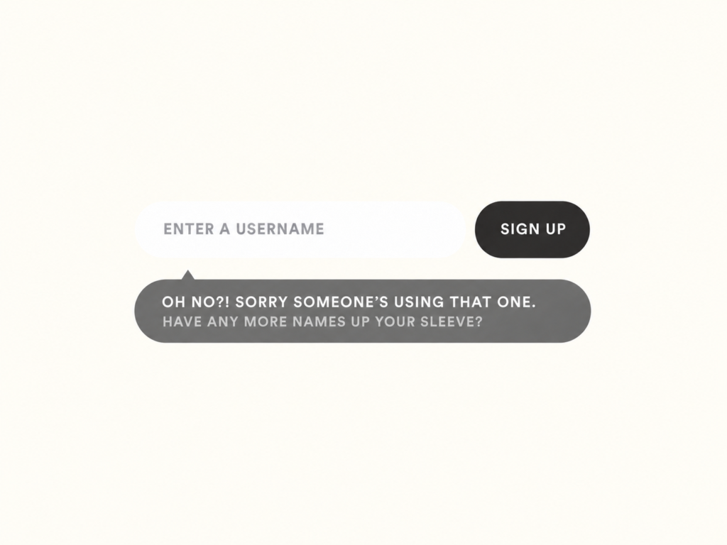
Brand voice matters, but clarity comes first. A witty error message that doesn’t explain what went wrong just adds friction. Draft the plain, functional version of every microcopy line first, then layer in personality only where it doesn’t slow comprehension. This is the backbone of any solid UX micro-copy and micro-interactions guide: words that work before words that charm.
3. Use Micro-Interactions to Confirm the Action
Every tap, toggle, or swipe needs a response, even a subtle one. A button that darkens on press, a checkbox that animates into its checked state, a toast that slides in and out: these are the smallest units of interface feedback, and they’re what make an app feel responsive rather than uncertain.
How Brucira Used Micro-Interactions to Speed Up BharatPe
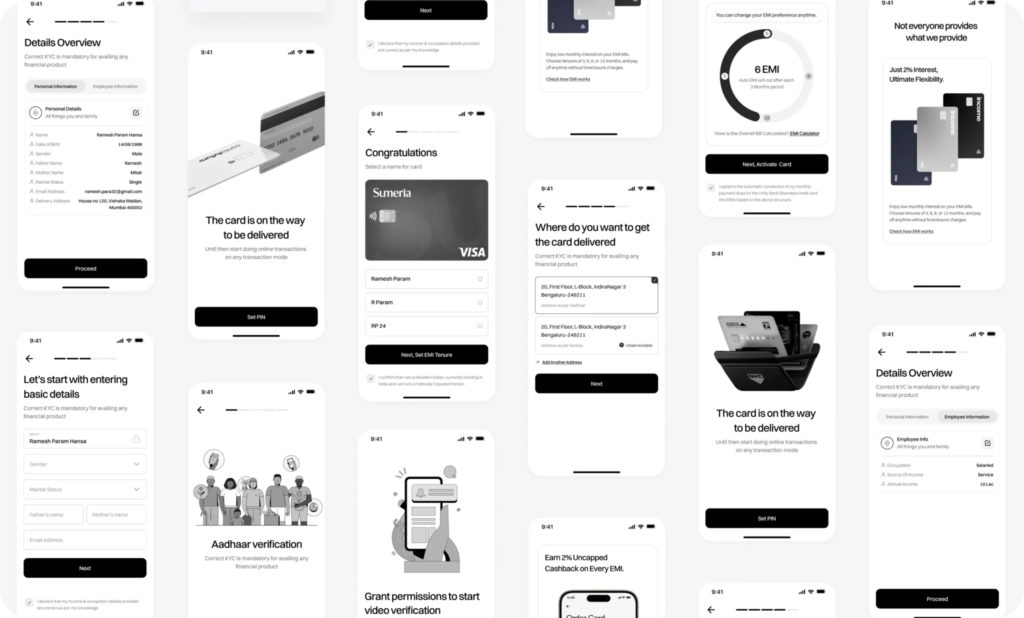
On the BharatPe app redesign, Brucira built micro-interactions and transitions directly into core flows like UPI transfers and bill payments, specifically to reduce perceived loading time. Transaction success states, onboarding, and everyday actions were all designed with motion that served a function, guiding attention and adding a sense of delight, rather than motion added purely for polish.
That project is a good reminder that a well-placed micro-interaction can make an app feel faster even when the underlying process takes exactly as long.
4. Design Empty, Loading and Error States as Content
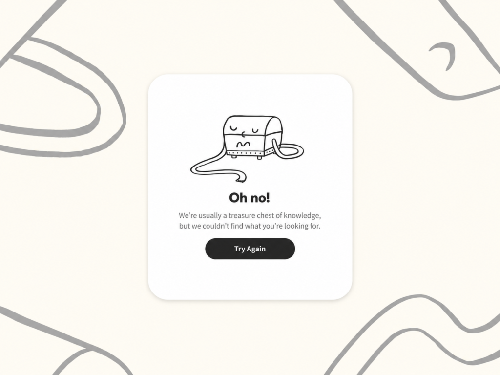
Empty states, loading spinners, and error screens are usually the last thing designed and the first thing users judge harshly. Write these as real content: what happened, why, and what to do next. Pair the copy with a small animation, a progress indicator, an icon, so the state doesn’t read as broken.
5. Choose Animation With Purpose, Not Decoration
The UI animation vs micro-interactions debate usually comes down to intent. Animation is the visual technique; a micro-interaction is the complete moment, trigger, rule, feedback, and loop. Not every micro-interaction needs heavy animation, and not every animation serves a micro-interaction. Use motion to show cause and effect (a card expanding, a list reordering), and skip it anywhere it just adds delay.
6. Guide First-Time Users With Contextual Microcopy
Onboarding is where UX microcopy earns its keep. Short, well-placed hints paired with subtle visual cues can teach a new layout faster than a walkthrough tour ever will.
How Brucira Used Motion for Responsive Feedback on Neo
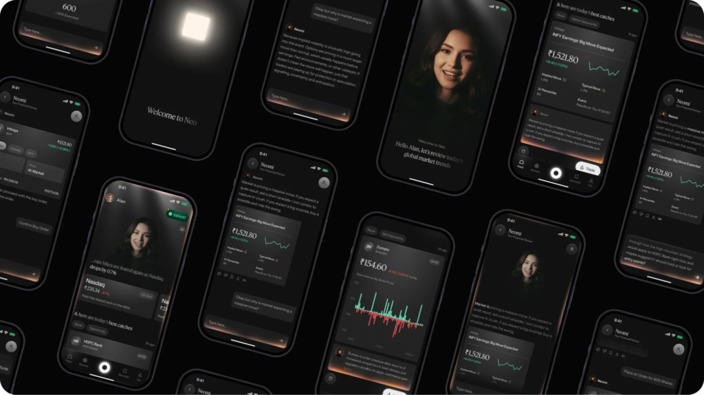
For Neo, a fintech platform built for experienced investors, Brucira layered subtle motion using Lottie and Rive to create “responsive feedback without distraction” across a dense, data-heavy interface. Paired with a dedicated onboarding experience and a usability audit that trimmed unnecessary steps, the animation work helped expert users execute trades faster without ever feeling like the interface was showing off, exactly the balance a strong UX micro-copy and micro-interactions guide should aim for.
Fintech products carry extra trust pressure, which made every motion cue and every line of copy count twice as much.
7. Keep Mobile Micro-Interactions Lightweight
Some of the best micro-interactions examples for mobile apps share one trait: they’re fast. On a phone, a micro-interaction that takes longer than 300-400 milliseconds starts to feel like lag, not polish. Favor native-feeling motion curves, keep haptics purposeful, and never let an animation block the user from moving on.
8. Test Microcopy and Interactions With Real Users
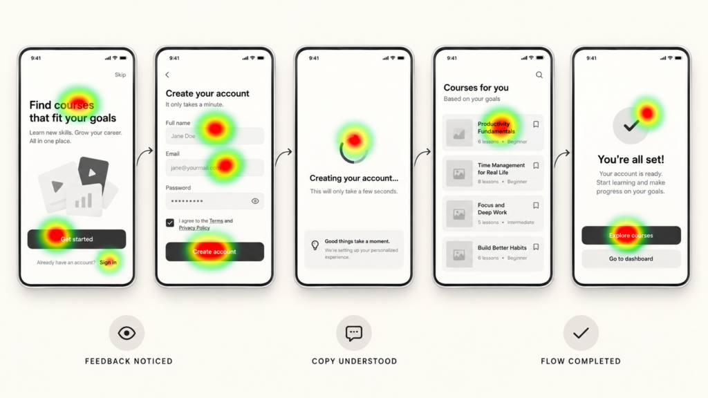
Assumptions about tone and timing rarely survive contact with real users. Run the same lightweight prototyping and iterative testing process you’d use for any interface change: watch whether people notice the feedback, understand the copy on first read, and complete the flow without hesitating.
9. Build a Shared Micro-Interaction and Microcopy Library
Once patterns are validated, document them. A shared library, standard error tone, consistent button states, a defined animation timing scale, keeps every new feature consistent with what users already trust, the same way a documented brand strategy and positioning keeps a company’s voice consistent everywhere else.
Final Thoughts
Microcopy and micro-interactions are easy to treat as afterthoughts because they’re small. But small is exactly why they matter: they’re the details users notice in every single session, whether or not they can name what felt right.
Have a UX project in mind? Reach out to Brucira at hello@brucira.com. For more design thinking, visit the Brucira blog, and see our work itself at brucira.com/work.
FAQs
Q1: What is the difference between UX microcopy and standard UI copy?
UX microcopy refers specifically to the small, functional bits of text, button labels, error messages, tooltips, empty states, that guide a user through a single moment. Standard UI copy can include longer marketing or instructional content. A good UX micro-copy and micro-interactions guide treats microcopy as a design element, not just a writing task.
Q2: What’s a simple way to think about UI animation vs micro-interactions?
Animation is the motion technique itself, easing, duration, transforms. A micro-interaction is the full moment: a trigger (the user’s tap), rules (what happens), feedback (what the user sees or hears), and loops (what happens on repeat). Animation is often how a micro-interaction delivers its feedback, but the two aren’t interchangeable terms.
Q3: What are some of the best micro-interactions examples for mobile apps?
Pull-to-refresh, a like button that bounces, a progress bar that fills smoothly, and a swipe-to-delete with a confirming color change are all strong, well-tested examples. The common thread across the best micro-interactions examples for mobile apps is speed: each one resolves in under half a second.
Q4: How does interface feedback affect user trust?
Interface feedback tells a user their action registered, whether that’s a color change, a sound, or a short confirmation line. Without it, users tend to tap again, assume something broke, or abandon the flow entirely. Consistent feedback, paired with clear UX microcopy, is one of the fastest ways to raise perceived reliability.
Q5: Do all mobile micro-interactions need custom animation?
No. Many effective mobile micro-interactions rely on native platform motion and simple state changes rather than custom-built animation. Custom animation is worth the investment for moments that are frequent, emotionally significant, or core to the brand experience, not for every single tap in the app.
Have questions about applying any of this to your own product? Get in touch with Brucira.