



“Good systems don’t reduce creativity.
They create more room for it.”
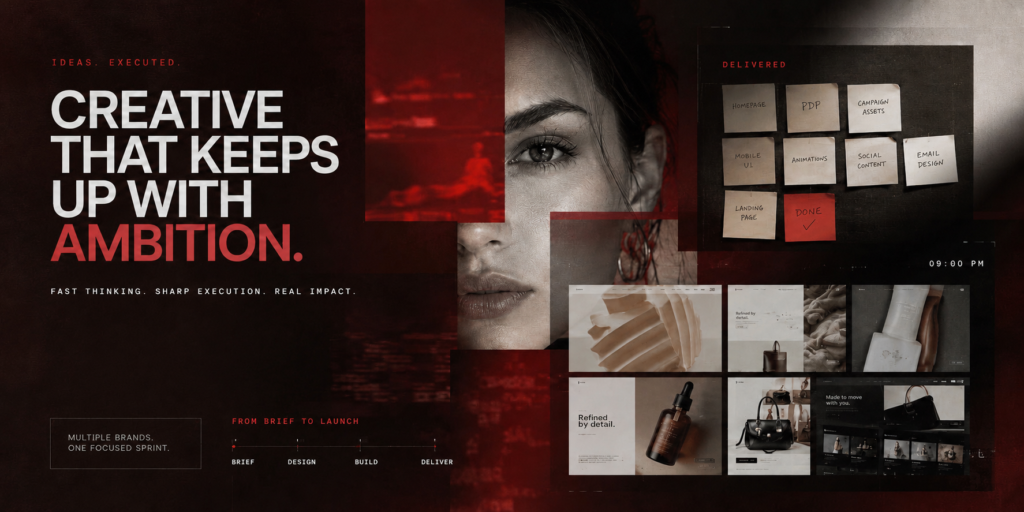
Three weeks.
Nine brands.
One Investor Day.
That was the brief we received from Foundery.
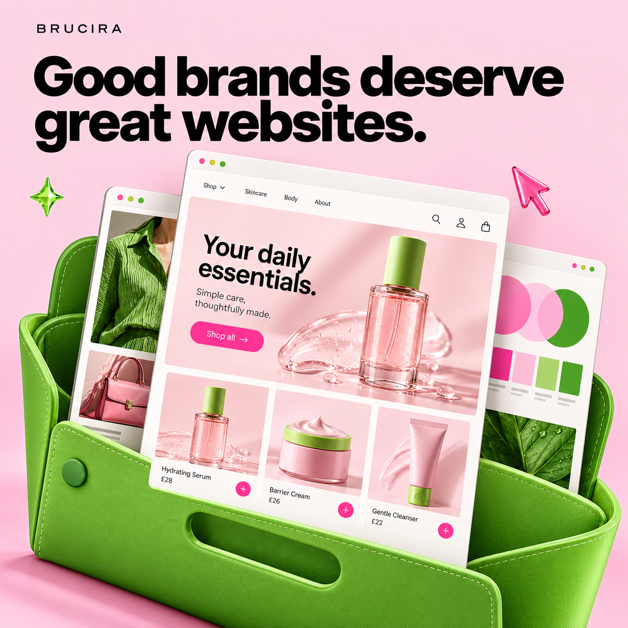
Foundery was bringing together a cohort of early-stage founders preparing to present their businesses, and our role was to shape the digital presence of nine of those brands before they stepped into that room. The challenge required us to rethink ecommerce web design process, startup branding and development at an unusually fast pace. It was an ecommerce web design challenge shaped as much by brand storytelling as by execution.
Projects with tight timelines aren’t new to us. But this project made us ask ourselves a different question.
Not “Can we move fast?”
But “Can we rethink the way you work without compromising the thinking behind the work?”
That question stayed with us throughout the project.
It started with a conversation.
One conversation between our founder, Harsh, and Kishore Biyani quietly shaped the direction of the entire project.
The takeaway was simple.
These founders weren’t trying to sell products yet.
They were trying to make investors believe in an idea.
That shifted our thinking immediately.
Instead of approaching ecommerce web design around products, categories or commerce, we started asking ourselves:
“What’s the first story an investor should experience?”
From that point on, every homepage became a narrative first, and a storefront second. Brand storytelling became the foundation of the process, helping each startup communicate its ambition before asking anyone to explore a product.
We optimized for decisions, not deliverables.
Our usual web design process is intentionally collaborative. Strategy, brand storytelling, wireframes, design exploration, refinement and development all happen over time because each stage improves the next.
For Foundery, the thinking couldn’t change.
The workflow had to be adapted.
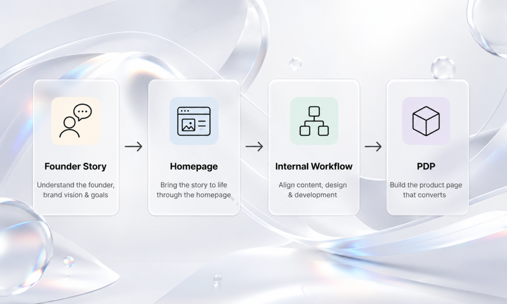
Every project started with a founder conversation. We understood the business, the ambition behind it and the story it wanted to tell. This helped us approach startup branding and ecommerce web design as one connected exercise rather than two separate deliverables.
By the end of the same day, we aimed to have a low-to-medium-fidelity wireframe ready.
Not because it was complete. Because alignment mattered more than polish.
Once everyone agreed on the narrative, design moved with surprising clarity. One of our biggest learnings was that confidence doesn’t come from high-fidelity mockups.
It comes from shared understanding.
Sometimes the biggest pivots happen on a Friday.
About a week before Investor Day, most homepages were well underway.
The Product Detail Pages weren’t.
We explored Shopify development and templated approaches, hoping they would help us move faster. But the more we customized them to match each brand, the less useful those templates became. For a project where every identity needed to feel distinct, a standard Shopify development workflow could not provide the flexibility required for the product page design.
Rather than forcing a solution that wasn’t working, we stepped back and changed the approach entirely.
It was a reminder that good execution isn’t about sticking to the original plan.
It’s about recognising when the plan needs to evolve.
Build the thinking once. Reuse it everywhere.
That final week led to another interesting question.
Were we actually solving nine different Product Detail Pages?
Or were we solving the same problem nine times?
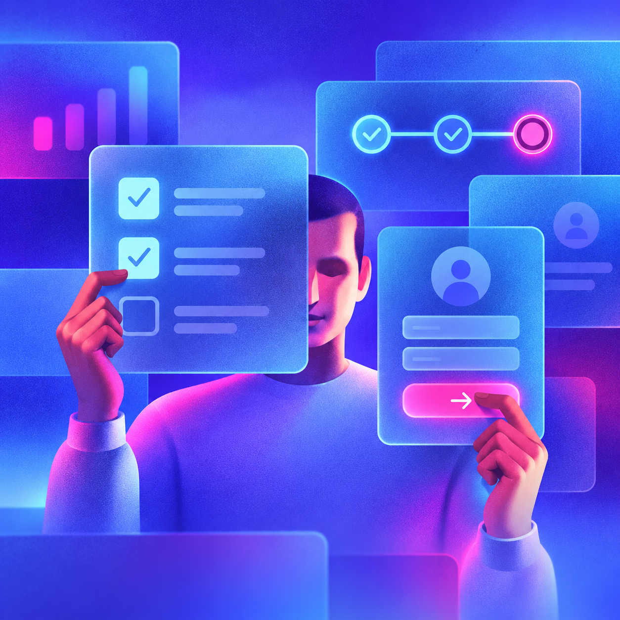
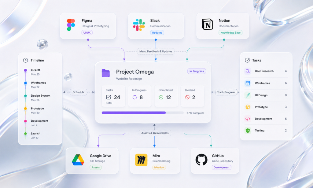
Our Design Manager built an internal AI web design workflow that analysed an existing homepage, understood its visual language and generated a matching Product Detail Page as a starting point. Instead of repeating the same instructions across every project, the team could build upon a shared system and spend more time refining the experience for each brand.
This AI-driven approach did not replace creative judgment. It gave the team a stronger starting point for product page design while keeping the visual identity, brand storytelling and usability consistent across every page.
The value wasn’t just speed.
It was consistency.
It allowed the team to focus on creative decisions instead of repetitive ones.
What Foundery left behind.
Every project leaves something behind.
Sometimes it’s a portfolio piece. Sometimes it’s a client relationship.
Foundery left us with a better way of working. Not because our existing process was wrong, but because this project demanded a different one.
It reminded us that strong processes aren’t rigid.
They’re adaptable.
The principles remained the same.
Story still came first.
Craft still mattered.
Collaboration still mattered.
What evolved was the system that brought all of those together under a very different set of constraints.
We delivered nine digital brand experiences in time for Investor Day. The homepages and Product Detail Pages were the visible outcome.
The systems we built along the way are the ones that continue to shape how we approach high-velocity startup branding and ecommerce web design at Brucira.