





Behind the making of the Flux Theory website
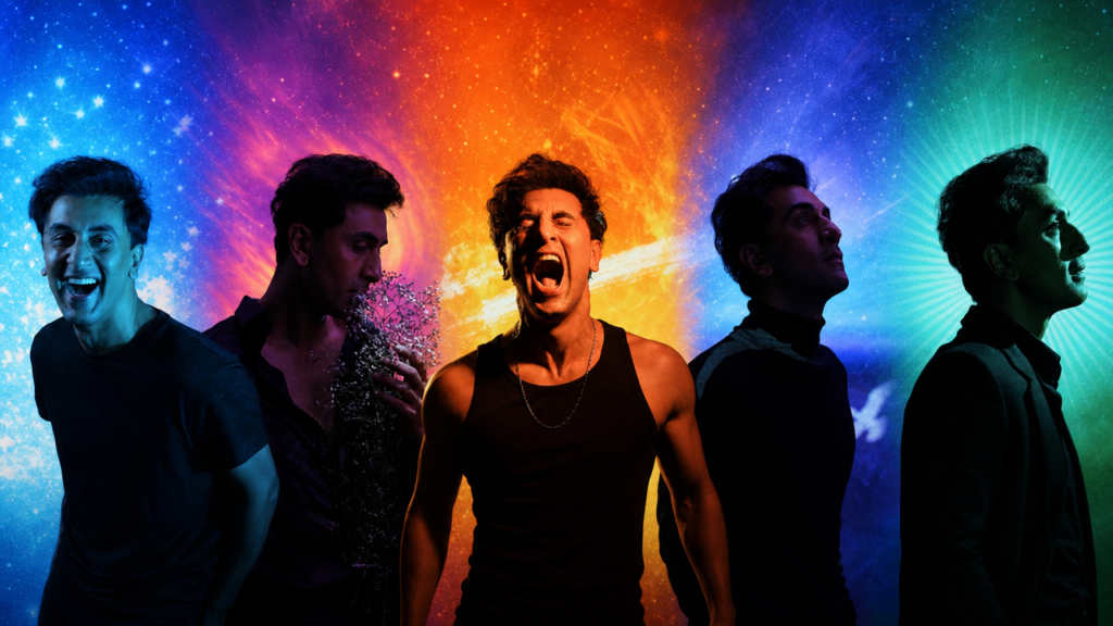
Who do you want to be today?
That question captures the thought Ranbir Kapoor brought to Flux Theory. A person moves through different roles, moods and versions of themselves. None of them has to be the definitive one. With Flux, he wanted to make room for that constant becoming and offer a more fluid view of masculinity.
At Brucira, we helped expand that vision into a digital world. We extended the brand’s visual language through immersive environments, motion and interaction, creating a website that gives its philosophy a tangible presence. Every part of the experience needed to express Ranbir’s idea while offering an intuitive way to discover the products.
It left us with a question of our own:
How do you design an experience that feels like it is always in flux?
One brand. Many ways of being.
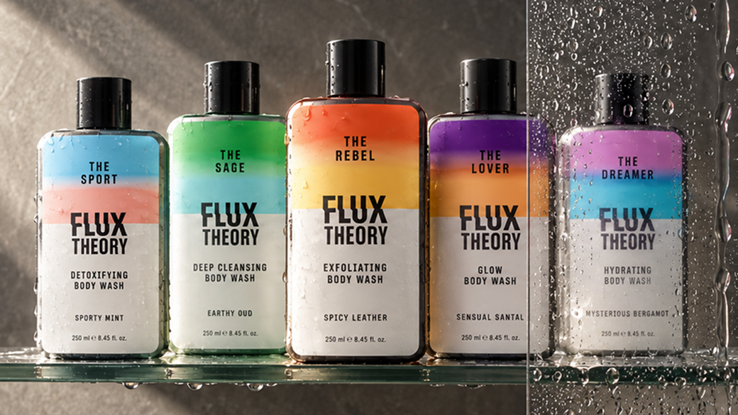
The Flux Theory identity is built around five archetypes: the Sport, the Sage, the Rebel, the Lover and the Dreamer. Each represents a different avatar someone might connect with on a given day, with its own fragrance, colour and visual world.
Holding those worlds together is the brand’s Industrial Chic aesthetic. Its metallic finishes and restrained design give Flux a consistent foundation, while the archetypes bring colour, atmosphere and emotion.
That relationship became our starting point. The website could not treat the five archetypes as five unrelated campaigns. Each needed its own presence, but moving between them had to feel natural. That was how we could reflect Ranbir’s idea:
“Identity changes, yet every version still belongs to the same person.“
We began with the idea of movement
Fluidity was central to how we imagined the website. We considered how the experience could shift and transform as someone moved through it, carrying the meaning of Flux into the way the site felt.
Movement became part of the storytelling. It connected the archetypes, gave the products depth and invited visitors to explore. Alongside that expressive quality, we designed a clear shopping journey, making discovery feel engaging and purchase feel intuitive.
From the atmosphere of each screen to the way the worlds connected, the experience was designed to carry a sense of flow. Rather than asking every element to change, we would create distinct environments for the archetypes and make the journey between them feel seamless.
Giving each archetype a world of its own
We called these environments the scapes. We storyboarded each world with its bottle at the centre, shaping the light, colour, depth and atmosphere around the character of its archetype. Sage, for example, inspired a more mystical setting.
We then built the scenes in 3D, developing their compositions until the products and their surroundings felt like one The scapes expanded the brand identity beyond its colours and graphics. They gave each avatar an atmosphere visitors could step into, turning product discovery into a more personal exploration.
Someone could move between different moods and ask which one felt like theirs today. At the same time, the bottles and the wider design language kept those experiences connected.
The worlds changed; the sense of Flux remained.
Making the experience feel as good as it looks
Bringing the scapes to life called for close collaboration between design and development. We approached every detail with an iterative mindset, refining depth, movement and transitions within the complete website.
For us, performance was part of the experience from the beginning. A world can be visually striking, but its impact is lost if it slows someone down. We kept testing and adjusting the balance between immersion and ease of use, especially on mobile.
Visual craft and performance held equal importance. The experience needed to feel immersive and respond effortlessly, especially on mobile. Each refinement helped preserve the richness of the worlds while making them smooth and comfortable to explore.
A considered combination of 3D and motion brought that balance together. The product worlds retain their dimensional quality, with an experience built to keep pace with the people moving through them.
Building a store around discovery
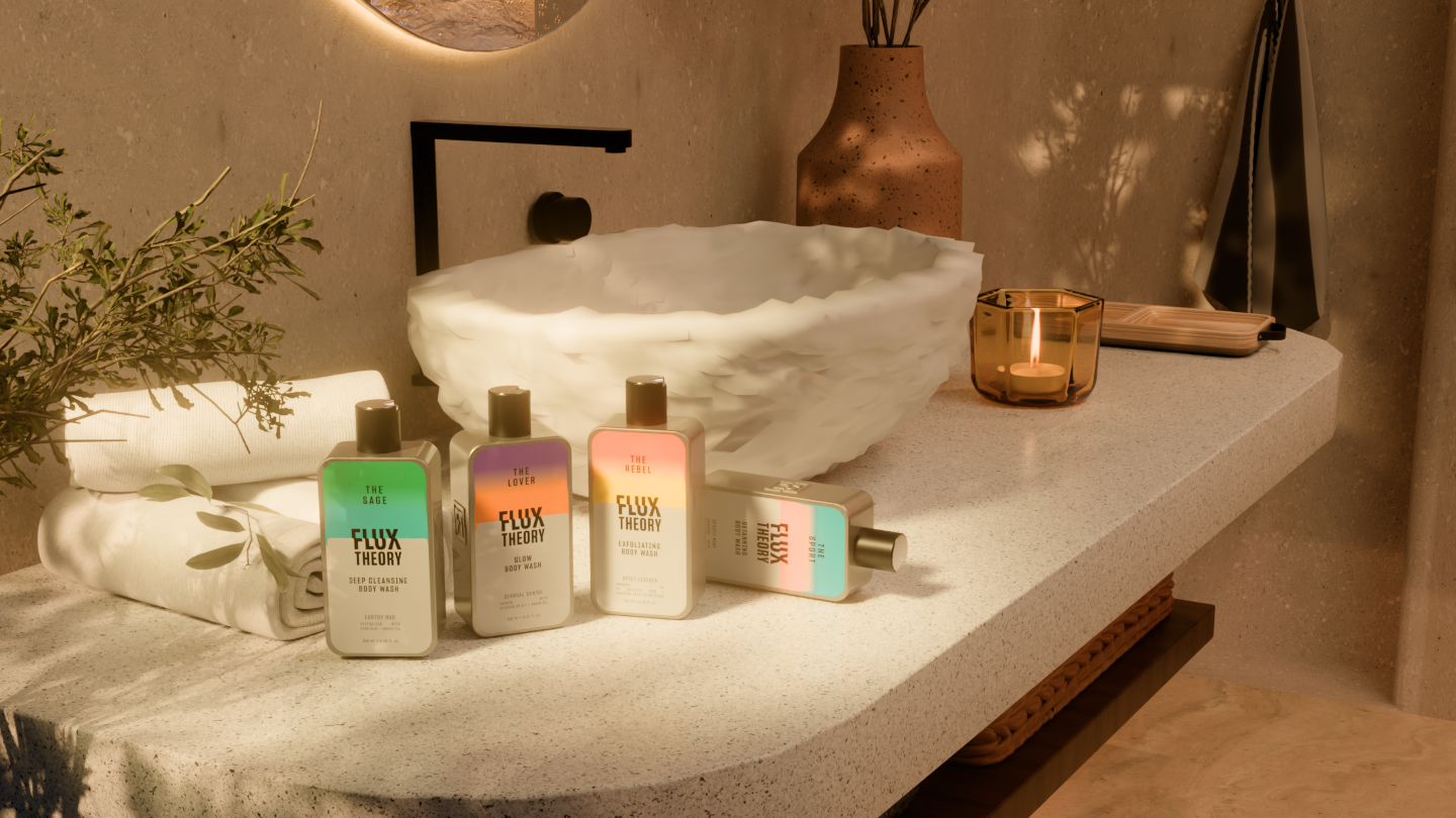
We designed the shopping experience with mobile at its centre. Within a small screen, visitors needed to understand the product, connect with its character and see a clear next step.
The scapes created the atmosphere. Thoughtful layouts, accessible product information and visible shopping actions gave the journey its structure. Each screen carried the mood of its archetype, with a consistent rhythm that made browsing feel familiar throughout.
That balance served Ranbir’s vision too. Flux invites people to explore different sides of themselves. We carried that invitation through the website, from the first impression to the moment someone found a product that felt like them.
We brought the ambition of a cinematic brand experience into the precision of an everyday shopping journey.
There is no final form
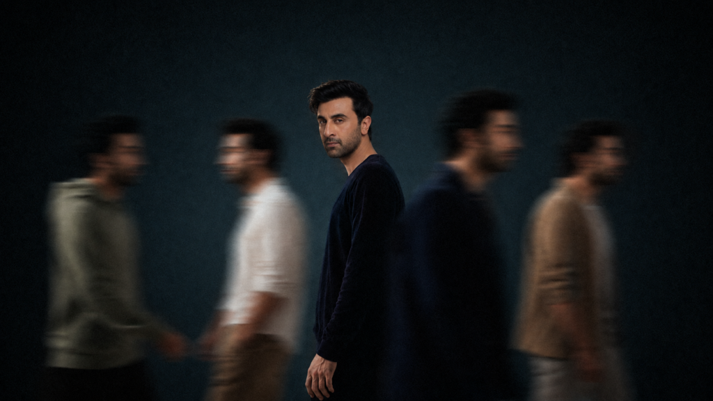
Flux Theory gave us a thought we returned to throughout the project: people are in a constant state of flow. Our process followed that spirit. We sketched, built, tested and refined until the brand’s visual worlds and the everyday experience of using the website worked together.
The finished site is an invitation to move between those worlds and find what feels right in the moment. Tomorrow, the answer might change. There is no final form.
Embrace your inner flux. Who do you want to be today?