




Screens are getting louder, and users are getting pickier about which ones they stick around for. Every year brings a fresh wave of interface trends, but only a handful actually earn a place in your product roadmap. Here’s a practical look at the top UI design trends shaping interfaces right now, and how to tell which ones deserve real screen time versus a passing scroll.
1. Glassmorphism: Frosted Layers That Add Depth
Glassmorphism uses translucency, blur and subtle borders to make elements feel like frosted glass floating above a background. Learning how to use glassmorphism in modern UI comes down to restraint: pair it with strong contrast behind the blur, keep text legible, and reserve it for cards, modals or navigation bars rather than an entire screen. Used sparingly, it signals depth and hierarchy without the heaviness of old-school skeuomorphic shadows.
How Brucira Built a Glassy Fintech Identity for Super Money
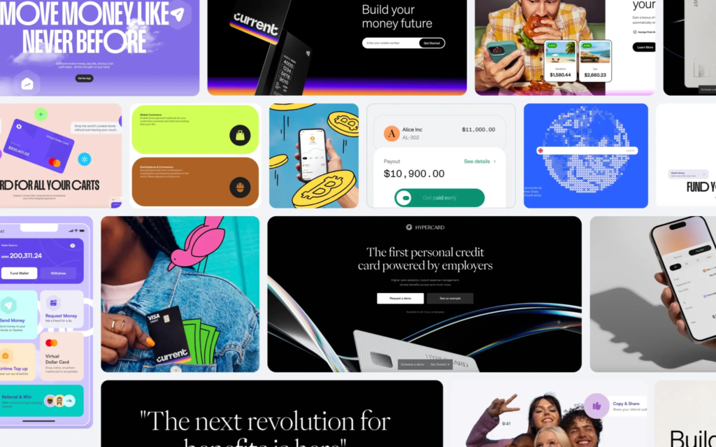
When Brucira partnered with Flipkart to launch Super Money, one of three visual directions explored was “Transparent Finance,” a glassy aesthetic built specifically to make a payments app feel light, modern and trustworthy rather than clinical.
The direction combined translucent surfaces with custom 3D and 8-bit illustration so cashback and rewards felt tangible on screen. It’s a good reminder that glassmorphism works best when it’s tied to a clear brand idea, not applied as decoration.
2. Dark Mode as a Default, Not an Afterthought
Good dark mode UI design guidelines start with color tokens, not a simple color inversion. Desaturate your palette, keep true black off large surfaces to reduce eye strain, and re-test contrast ratios separately for light and dark themes. Users increasingly expect to toggle themes on day one, so building dark mode into your brand strategy and positioning work early saves a costly retrofit later.
3. Bento Grid Layouts for Content-Dense Screens
Among the top UI design trends reshaping dashboards this year, the bento grid UI layout design trend stands out. It borrows from Japanese lunchboxes: modular, differently sized cards arranged in a tidy grid that lets you showcase varied content (stats, images, short copy) without a cluttered feed. It’s especially useful for dashboards, pricing pages and portfolio sites where you need visual variety inside a disciplined structure. Keep spacing consistent and limit yourself to two or three card sizes so the grid still reads as one system.
How Brucira Moved Swiggy Scenes Beyond the Standard Card Grid
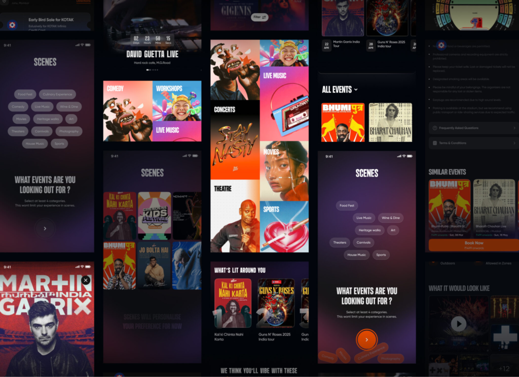
For Swiggy Scenes, Swiggy’s local events and food-culture discovery feature, Brucira deliberately moved past the standard card layout to a “visual-first discovery system” built around bold gradients, expressive event tiles and pill-shaped filters.
Tiles reorganize dynamically with a pinch-to-zoom interaction as users move between broad categories and detailed event views, turning a typical content grid into what the team calls “a navigable world” rather than a static feed. It’s a strong example of a bento-style layout pushed further with real interaction design.
4. Flat Design vs Neumorphism vs Skeuomorphism
Comparing flat design vs neumorphism vs skeuomorphism is really a conversation about how much realism a product needs. Flat design favors clean shapes and flat color for speed and clarity. Neumorphism adds soft, extruded shadows for a tactile feel but struggles with accessibility. Skeuomorphism leans on real-world textures and metaphors, useful in niche, tactile-feeling apps but rare in mainstream software today. Most modern interfaces land closer to flat design with selective depth cues borrowed from the other two.
5. Mobile-First Micro-Interactions
Design trends for mobile applications increasingly center on small, purposeful animations: a button that gently bounces on tap, a progress bar that fills with a satisfying ease. These micro-interactions confirm an action succeeded and make dense mobile UI trends like bento grids and bottom-sheet navigation feel considered rather than cramped. Validate them through real prototyping and iterative testing rather than gut feel, since what reads as delightful on a 6-inch screen can feel gimmicky on a tablet.
6. Bold, Expressive Typography
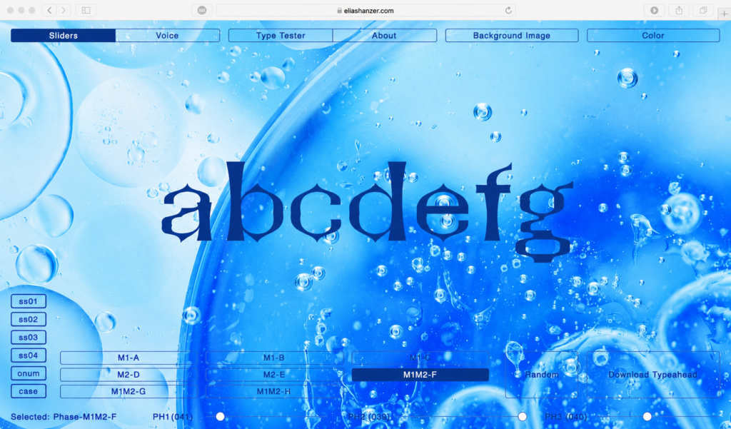
Interface trends this year lean into oversized, characterful type as a primary design element rather than a supporting one. Large type sets hierarchy instantly and reduces reliance on decorative graphics, which also helps performance on slower connections. Pairing a distinct display face with a quiet, highly legible body font remains the safest way to get personality without sacrificing readability.
7. Accessible Motion and Contrast
As more of these modern UI trends lean on blur, animation and low-contrast dark palettes, accessibility has to be part of the definition of done, not a final audit. Respect reduced-motion settings, verify contrast in both themes, and make sure glass panels and neumorphic buttons still read clearly to users with low vision. A trend that only works for some of your users isn’t ready to ship.
8. Minimal, Contextual Navigation
Rounding out the top UI design trends worth watching, menus are shrinking. Bottom sheets, contextual tab bars and gesture-based navigation are replacing dense top menus, especially on mobile, because they keep the interface focused on the task at hand rather than every possible destination at once. This pairs naturally with bento grids and bold typography to keep dashboards and apps feeling calm even as feature sets grow.
Final Thoughts
None of these top UI design trends work in isolation. Glassmorphism, dark mode, bento grids and expressive type all succeed or fail based on whether they make an interface easier to use, not just easier to screenshot. Treat trend-watching as a starting point for exploration, then let usability testing decide what actually earns a place in your product.
Have a UI design project in mind? Reach out to Brucira at hello@brucira.com. Explore more posts on the Brucira blog or see recent work in our portfolio.
FAQs
Q1: What are the top UI design trends to watch right now?
The top UI design trends for 2026 include glassmorphism, dark mode as a default theme, bento grid layouts, expressive typography and accessible, motion-aware interfaces. The common thread across all of them is restraint: each trend earns its place only when it makes a screen easier to use, not just easier to screenshot.
Q2: How do I use glassmorphism in modern UI without hurting readability?
Learning how to use glassmorphism in modern UI starts with contrast. Apply the frosted, blurred effect to smaller surfaces like cards, modals or navigation bars, keep a strong color or image behind the blur, and always test text legibility at real device brightness before shipping.
Q3: What are some practical dark mode UI design guidelines?
Solid dark mode UI design guidelines include avoiding pure black on large surfaces, desaturating your color palette slightly, and re-testing contrast ratios for every component in both themes rather than assuming an automatic color inversion will look right.
Q4: Flat design vs neumorphism vs skeuomorphism, which one should I choose?
Weighing flat design vs neumorphism vs skeuomorphism comes down to your product’s personality and accessibility needs. Flat design suits most modern software, neumorphism can add tactile charm for niche experiences if contrast is handled carefully, and skeuomorphism still works well for apps that lean on real-world metaphors.
Q5: What are the biggest design trends for mobile applications this year?
Current design trends for mobile applications include the bento grid UI layout design trend for dashboards, bottom-sheet navigation, purposeful micro-interactions and bold typography that scales cleanly across screen sizes. Together they define where mobile UI trends and broader visual design trends are heading next.
Want help applying these interface trends to your own product? Get in touch with Brucira.