





Typography can make a website feel clear before a user has read a full sentence. Headline size, line spacing and contrast all influence where attention goes first.
Good typography web design improves readability, creates structure and helps a digital experience feel consistent with the brand.
The challenge is balancing personality with usability. Here are ten practical rules for getting it right.
What Is Typography in Web Design?
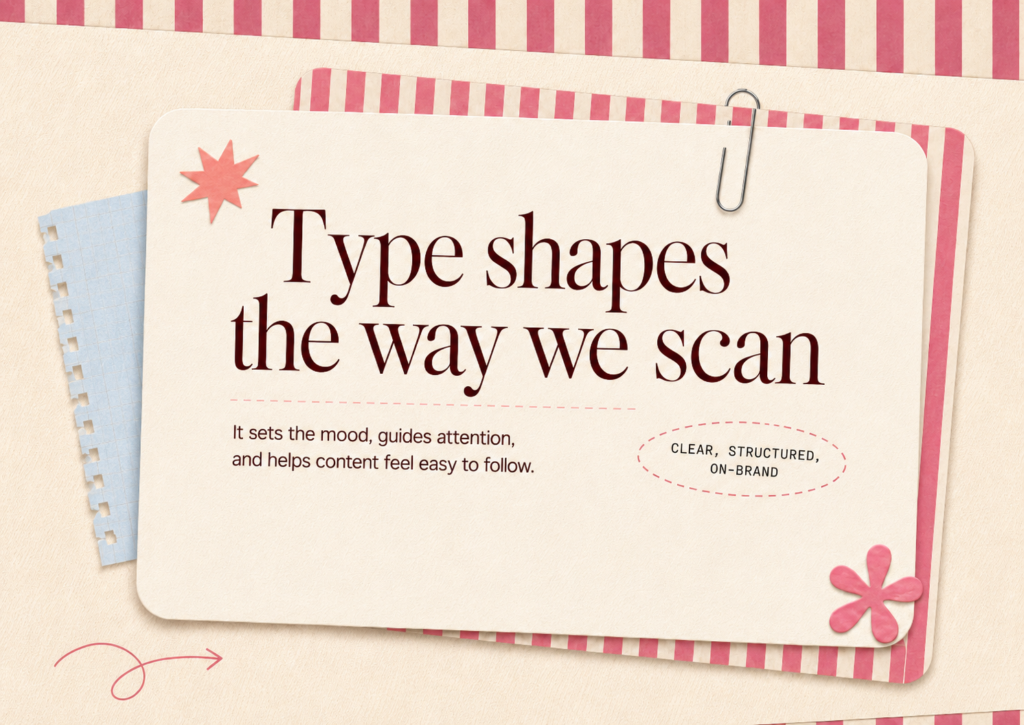
Before looking at the rules, it helps to understand what is typography in web design.
Typography in web design is the way typefaces, font sizes, weights, spacing and text styles are selected and organised across a digital interface.
While what is typography in graphic design covers type across print and wider visual communication, web typography must also respond to different screen sizes and interactions.
Effective typography web design connects readability, visual hierarchy and brand personality.
1. Choose Typefaces That Match the Brand
A font should support how a brand wants to be perceived.
A geometric sans serif may feel modern and precise, while a serif can add warmth or editorial character. The right choice depends on the audience and positioning.
In typography web design, brand expression should never make text harder to understand.
2. Keep the Font System Simple
Too many typefaces can make a website feel fragmented.
Most interfaces can work with one flexible type family or a carefully chosen pair. Different weights and sizes create enough variation for headings, body copy, labels and buttons.
A restrained typography web design system is also easier to maintain as the website grows.
3. Establish a Clear Type Hierarchy
Users often scan headings, supporting text and actions before reading closely.
Hierarchy in typography uses size, weight, spacing and placement to signal importance. Clear headings and consistent body copy create visual hierarchy without excessive decoration.
How Brucira Used Typography to Strengthen ATC’s Brand
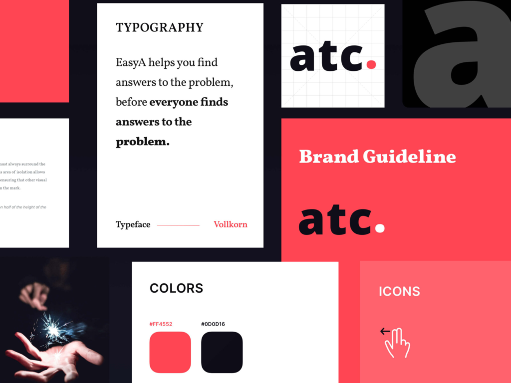
ATC needed a website that felt innovative, sophisticated and easy to navigate. Brucira created a visual direction where bold typography, high contrast and minimal layouts communicated confidence and technological precision.
The type system became part of the wider brand identity rather than an isolated styling decision. It shows how typography web design can support hierarchy and positioning together.
4. Make Body Copy Easy to Read
Body text carries most of a website’s information, so readability should come before novelty.
Choose a comfortable size, avoid difficult letterforms and give lines enough breathing room. Paragraphs should also be short enough to scan.
Good typography web design reduces the effort required to understand content.
5. Control Line Length
Very wide paragraphs can make it harder for the eye to move between lines. Extremely narrow columns create frequent breaks and interrupt reading rhythm.
Set a sensible maximum width for long-form content instead of stretching copy across the entire screen.
This small typography web design decision can make dense information easier to consume.
6. Use Line Height and Spacing Intentionally
Typography needs space to work.
Tight line spacing can make paragraphs feel crowded, while excessive spacing can disconnect related content. The same applies to spacing between headings and paragraphs.
Consistent spacing strengthens visual hierarchy and gives typography web design a clearer rhythm.
7. Design for Responsive Screens
Typography that works on desktop may feel oversized or cramped on mobile.
Font sizes, line lengths and spacing should adjust across breakpoints while preserving hierarchy. Responsive typography web design is about maintaining readability and emphasis as the available space changes.
How Brucira Built a Type System for Ren Payments
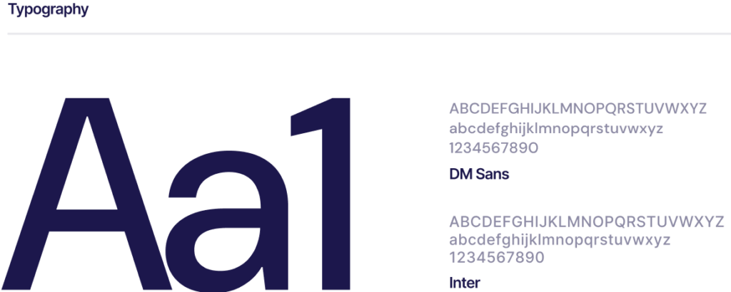
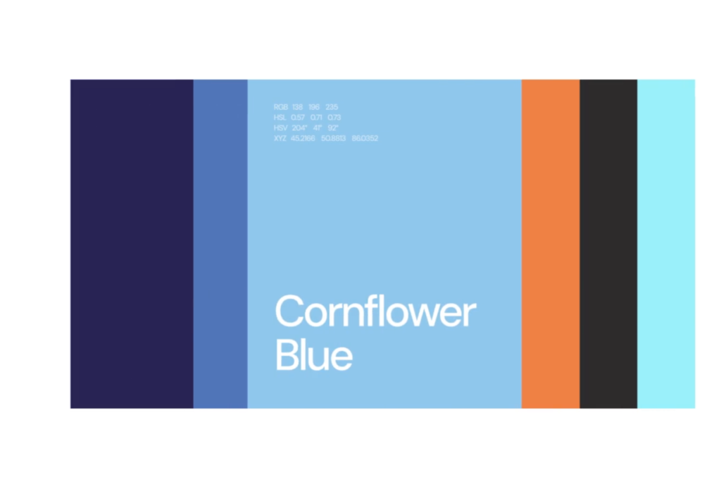
For Ren Payments, Brucira built the design system around the brand’s existing colours and the typefaces DM Sans and Inter. The system established consistent typography, spacing and layouts across the website, with fonts selected for readability and a modern digital feel.
This demonstrates how typography web design can become part of a scalable design system instead of being decided page by page.
8. Create Enough Contrast
Important text should look important.
Headings need enough distinction from body copy, while buttons, captions and labels should remain recognisable without competing for attention.
Contrast can come from size, weight, colour and spacing. Strong hierarchy in typography comes from applying these differences consistently throughout typography web design.
9. Test Typography With Real Content
A type system may look polished with placeholder copy but behave differently with actual headlines, product descriptions or longer paragraphs.
Test short and long content, buttons, numbers and smaller screens before finalising the system.
Effective typography web design must work with the content the website actually needs to communicate.
10. Build Typography Into the Design System
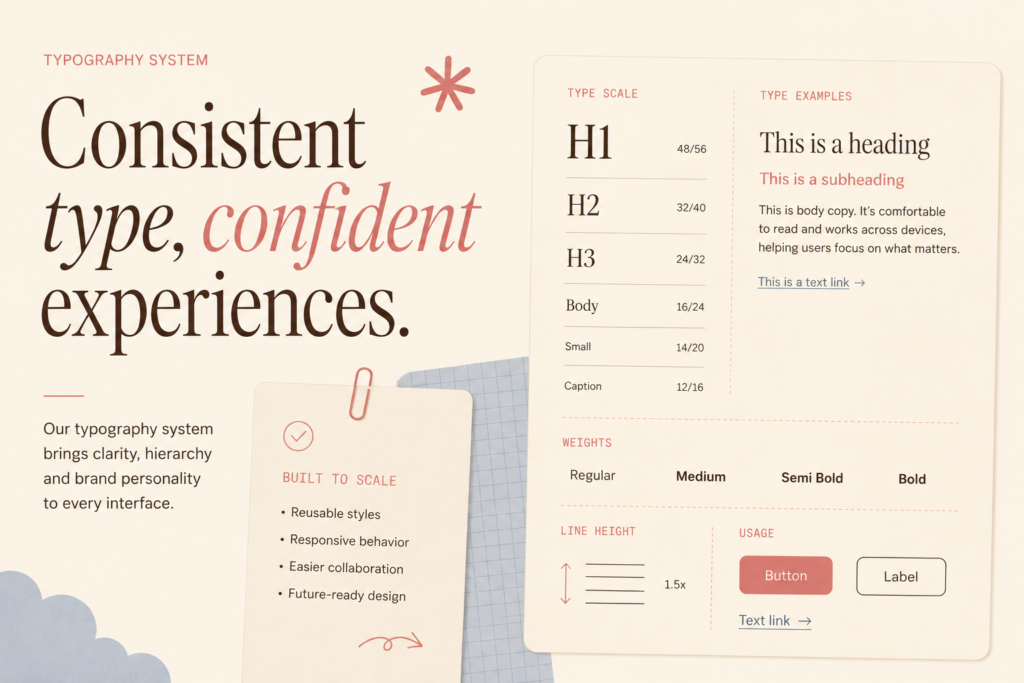
Typography decisions should not be reinvented on every page.
Define reusable styles for headings, paragraphs, labels, links and buttons. Document sizes, weights, line heights and responsive behaviour.
A structured typography web design system makes future pages easier to create while keeping the brand experience consistent.
Final Thoughts
Typography shapes how people read, navigate and interpret a website.
Strong typography web design starts with appropriate typefaces, then builds clear hierarchy, comfortable reading patterns and responsive rules around them. Consistent typography web design helps usability and brand recognition work together across every page.
Have a website or digital product in mind? Reach out to Brucira at hello@brucira.com.
Want more design insights? Browse our blogs and explore Brucira’s portfolio of projects.
FAQs
Q1: What is typography in web design?
What is typography in web design refers to how fonts, sizes, weights, spacing and text styles are organised across websites and digital interfaces. Good typography web design makes information easier to read while reinforcing the brand’s visual identity.
Q2: Why is typography important in web design?
Typography in web design affects readability, navigation, brand personality and visual hierarchy. Users should be able to quickly understand which information is most important and where to look next.
Q3: What is hierarchy in typography?
Hierarchy in typography is the use of different font sizes, weights, spacing and styles to indicate the importance of information. In typography web design, a clear hierarchy helps users scan pages and understand content faster.
Q4: What is the difference between typography in graphic design and web design?
What is typography in graphic design usually refers to arranging type across visual communication such as posters, packaging and publications. Typography in web design also considers responsive screens, interaction, usability and digital consistency.
Q5: How can Brucira improve website typography?
Brucira combines branding, UX/UI design and design systems to create typography web design that supports readability, visual hierarchy and brand identity. If your website needs a clearer, more distinctive digital experience, reach out to Brucira at hello@brucira.com.