




A digital product can look polished and still feel frustrating. Users struggle to find a page, complete a task, or understand where to go next, and often the problem isn’t the visual design. It’s the structure underneath it. Following information architecture best practices helps teams organise content, navigation and user journeys around how people actually think, rather than how the org chart is drawn.
What Is Information Architecture?

Information architecture is the process of organising, labelling and connecting content within a digital product. In information architecture UX, designers decide how information should be grouped, what labels users will understand and how different screens should connect. Think of it as the blueprint of a building: users never see the framework, but it determines whether they can move through comfortably.
1. Begin With User Goals
The first of our information architecture best practices is to begin with what users want to accomplish, not with internal departments or business units. Users arrive with goals such as comparing options, understanding a service or completing a purchase.
User interviews, search data, analytics and support queries reveal these priorities, helping teams structure content around real user intent rather than internal assumptions.
2. Audit Existing Content
Before changing the structure, understand what already exists. A content audit identifies every page, screen and information type within the product, revealing duplicate content, outdated pages, unclear ownership and gaps in the journey. A heuristic evaluation is one structured way to run this kind of audit before deciding what to keep, rewrite or cut.
3. Create Clear Content Groups
Once the content is understood, group related information into logical categories. Card sorting lets users organise topics in ways that make sense to them, which is especially valuable when internal teams disagree about where something belongs. Effective information architecture UX avoids categories that overlap excessively.
4. Build a Clear Hierarchy
Hierarchy shows users which information matters most and how content levels relate to one another. A website might move from a homepage to a service category, then to an individual page, each level providing enough context to help users decide where to go next. One of the most useful information architecture best practices is keeping important content within a few meaningful steps.
How Brucira Restructured Pine Labs’ Information Architecture
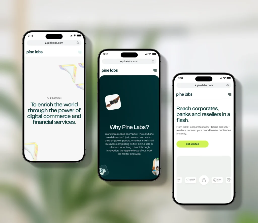
Brucira applied this approach while redesigning the Pine Labs website. With several acquired products and services operating under one brand, the homepage needed a structure that could communicate the full offering without overwhelming users. Brucira built a clear, scalable information architecture that let each solution sit naturally within the wider Pine Labs ecosystem.
5. Use Familiar Navigation Labels
Creative labels can express personality, but clarity should come first. A label like “Our Thinking” may sound distinctive, but “Insights” or “Blog” is easier to understand at a glance. Good website navigation design uses concise, descriptive, familiar language, kept consistent across desktop menus, mobile navigation, breadcrumbs and page headings.
6. Keep Navigation Focused
More choices don’t always improve usability. Applying information architecture best practices means prioritising the most valuable destinations within the primary navigation, with secondary links living in dropdown menus, page content or the footer. Mobile experiences need even greater focus, where hierarchy, grouping and progressive disclosure become essential.
7. Map User Flows Around Tasks
A user flow maps the steps someone takes to complete a specific goal: creating an account, booking a consultation, purchasing a product. Each flow needs a clear entry point, action and outcome, and teams should account for alternative paths, errors and moments where users drop off.
How Brucira Simplified User Flows for SuperMoney
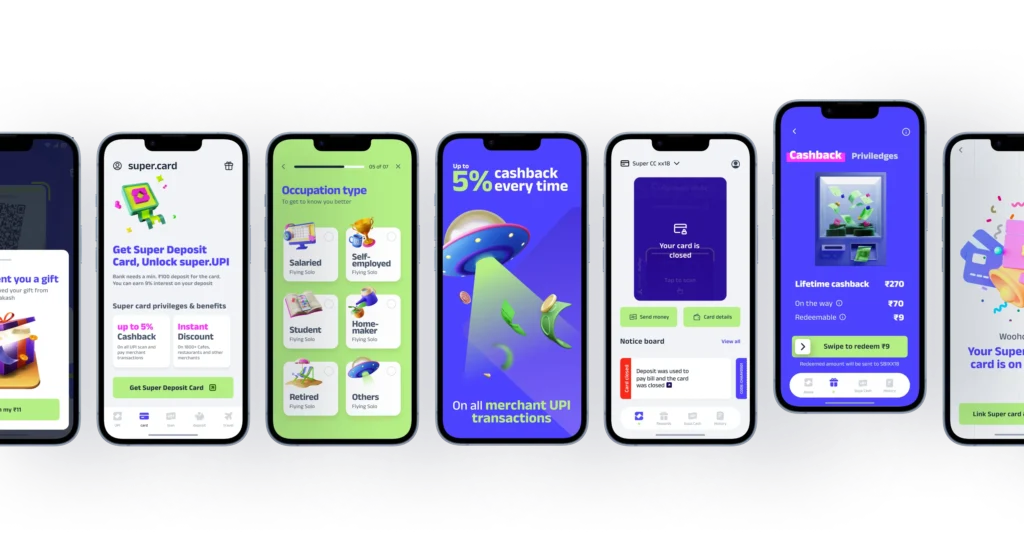
For the SuperMoney mobile app, Brucira studied different user flows and adjusted the interface around the needs of each journey. This created a more seamless experience while maintaining consistent branding and visual language throughout the app, and it shows why flows need to be understood before individual screens get designed.
8. Understand User Flow vs Wireframe
The difference between user flow vs wireframe comes down to journey and interface. A user flow shows how users move between actions or screens; a wireframe shows what one screen contains and how its elements are arranged. Teams should generally define the flow before developing detailed wireframes, since a well-designed screen can’t repair a confusing journey. Brucira’s product design process treats this sequencing as a fixed step, not an afterthought.
9. Design for Different Entry Points
Users don’t always begin on the homepage. They arrive through a search result, a campaign, a shared link or a blog post, so every important page needs enough context to help them understand where they are and what to do next. Breadcrumbs, descriptive headings, related links and clear calls to action reinforce the overall structure, one of the most overlooked information architecture best practices on content-heavy sites.
10. Test and Improve the Structure

Information architecture should be tested before visual design is finalised. Tree testing shows whether users know where to look for something; usability testing reveals whether the proposed navigation and flows hold up in realistic tasks. Brucira’s approach to prototyping and iterative testing builds this checking-in loop into the process rather than treating it as a final gate. Analytics should keep informing decisions after launch too, since search behaviour and abandoned journeys point to where the structure still needs work.
Final Thoughts
The best digital experiences don’t make users think about structure. They simply make the next step feel obvious. By following information architecture best practices, teams create clearer hierarchies, more usable navigation and smoother paths through complex products, giving visual design and content a stronger foundation to build on.
Have an information architecture project in mind? Reach out to Brucira at hello@brucira.com. You can also browse more posts on the Brucira blog or see recent work on brucira.com/work.
FAQs
Q1: What are information architecture best practices?
Information architecture best practices include understanding user goals, auditing content, creating logical categories, establishing a clear hierarchy, using familiar labels and testing the structure with real users.
Q2: Why is information architecture important in UX design?
Information architecture UX helps users understand where they are, find relevant content and complete tasks efficiently. It also gives navigation, user flows and interface design a logical foundation to sit on.
Q3: What is the difference between user flow and wireframe?
When comparing user flow vs wireframe, a user flow maps the steps within a journey, while a wireframe defines the content and layout of an individual screen.
Q4: How can website navigation design be improved?
Effective website navigation design uses clear labels, focused menus, logical groupings and consistent patterns. Testing can reveal whether users understand the structure as intended.
Q5: How can Brucira improve a product’s information architecture?
Brucira applies information architecture best practices through user research, content audits, hierarchy planning, user-flow mapping, wireframing and usability testing. Get in touch to build a clearer digital experience.