




Most digital products are still built for one kind of user: someone with perfect vision, a steady hand, a fast connection, and fluent English. Inclusive design and web accessibility guidelines exist because that user is the exception, not the rule. Here are nine practical steps to help your team design and build products that genuinely work for everyone.
1. Start With Color Contrast, Not Just Color Choice
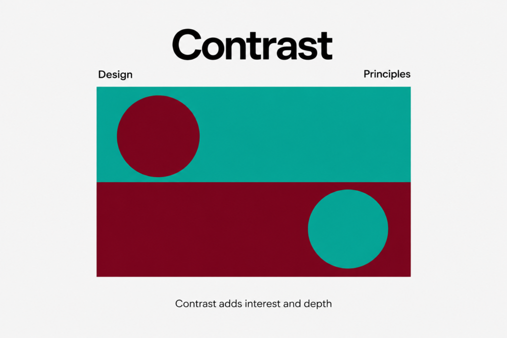
Before you touch a component library, audit your palette for contrast ratios. Text against background should hit at least 4.5:1 for body copy and 3:1 for large headings, per WCAG design standards. Low-contrast gray-on-white text might look elegant in a mockup, but it quietly excludes users with low vision, color blindness, or anyone reading on a phone in direct sunlight. Run every core screen through a contrast checker before it ships, not after a complaint.
2. Design for Keyboard and Screen Reader Navigation
A surprising number of users never touch a mouse or trackpad: people with motor impairments, power users, and anyone relying on assistive technology. Every interactive element, from nav menus to modal close buttons, needs a visible focus state and a logical tab order. Pair that with semantic HTML and proper ARIA labeling so screen readers announce what a button does, not just that it exists. This single habit does more for accessible UX than almost any visual polish.
3. Make Typography Legible for Every Reader
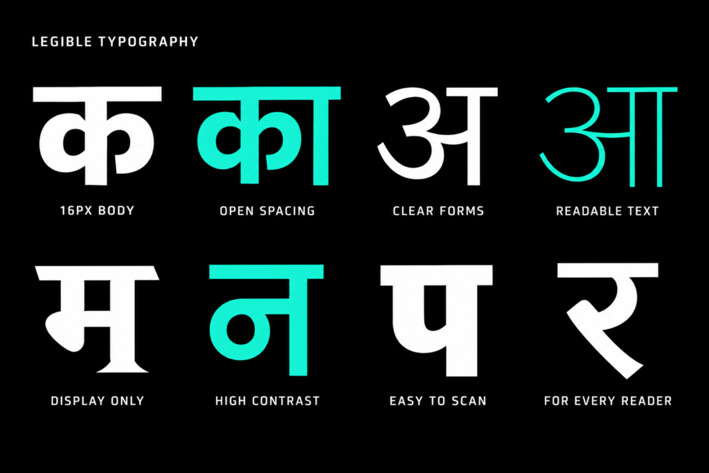
Small type, tight line spacing, and decorative fonts set entire paragraphs look great in a pitch deck and terrible in daily use. Set body text no smaller than 16px, give lines enough breathing room, and reserve display fonts for headlines only. Legible typography is one of the simplest, highest-leverage moves in inclusive UX, and it pays off for aging users, dyslexic readers, and everyone squinting at a screen on the move.
4. Write Alt Text That Actually Describes the Image
Alt text is often an afterthought, filled in with the file name or left blank entirely. For someone using a screen reader, that empty tag is a gap in the page’s meaning. Describe what the image communicates, not just what it depicts: a product photo needs different alt text than a decorative background pattern, and purely decorative images should be marked so screen readers skip them cleanly.
5. Build Forms People Can Actually Complete
Forms are where accessibility gaps become abandonment. Label every field clearly, keep instructions visible instead of hidden in placeholder text that disappears on click, and surface errors in plain language next to the field that caused them. Group related fields logically and avoid timing users out too aggressively. A form that’s easy to complete with a screen reader is usually easier for everyone else too.
6. Localize and Translate With Care, Not Just Convenience
Accessibility guidelines aren’t only about ability, they’re also about language and culture. Machine-translated copy dropped into a layout designed for English often breaks visually and reads awkwardly, which quietly tells non-native speakers they’re an afterthought.
How Brucira Increased Reach for Disney+ Hotstar Through Inclusive Vernacular Design
Brucira worked with Disney+ Hotstar to hand-craft movie poster titles in Hindi, Tamil, and Telugu for 28 major films, collaborating with language experts to preserve each script’s structure rather than simply transliterating English titles. The result bridged regional audiences with international content and, per Disney+ Hotstar’s own design team, “garnered love from millions of users,” showing how thoughtful localization is inclusive design in action.
7. Simplify Complex Flows for Every Skill Level
Accessibility best practices extend to cognitive load, not just sensory needs. Financial tools, dashboards, and anything involving multi-step decisions should strip jargon, break tasks into clear stages, and use visuals that build confidence instead of intimidation.
How Brucira Made Investing Feel Simple for Groww
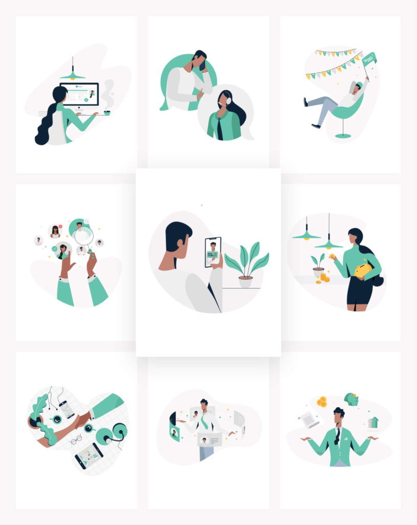
For Groww, Brucira built an illustration system designed to make investing feel approachable to everyday users rather than financial experts. Cool palettes, calm character forms, and minimal compositions replaced intimidating financial imagery, and the visuals were polished enough to still be in use across Groww’s website and app today. It’s a reminder that inclusive UX often lives in tone as much as function.
8. Test With Real Users, Not Just Automated Tools
Automated accessibility scanners catch missing alt text and contrast failures, but they can’t tell you whether a screen reader user can actually complete checkout. Pair scanner results with usability testing that includes people who use assistive technology day to day, the same way you’d run a broader heuristic evaluation of your product.
9. Follow WCAG as a Baseline, Not a Checklist
WCAG design guidelines are a floor, not a finish line. Meeting AA compliance is necessary, but teams that treat accessibility as an ongoing design principle, revisited with every new feature, end up with genuinely inclusive products rather than ones that merely pass an audit.
Final Thoughts

Inclusive design and web accessibility guidelines aren’t a separate workstream bolted onto a project, they’re a lens applied to every decision, from color palettes to copywriting to code. Start with the steps that touch the most users first, and build the rest into your process over time.
Have an inclusive design or accessibility project in mind? Reach out to Brucira at hello@brucira.com. Explore more design thinking on the Brucira blog or see our approach in action across our portfolio.
FAQs
Q1: What are the core inclusive design and web accessibility guidelines every team should follow?
At minimum, teams should prioritize color contrast, keyboard and screen reader navigation, legible typography, descriptive alt text, and accessible forms. These cover the majority of everyday barriers users face and align closely with WCAG design standards.
Q2: What’s the difference between accessible UX and inclusive UX?
Accessible UX typically refers to meeting specific technical standards like WCAG for users with disabilities, while inclusive UX is broader, accounting for language, culture, device, connection speed, and cognitive load. In practice, the two overlap heavily and are best pursued together.
Q3: Do accessibility best practices slow down design and development?
Not when they’re built in from the start. Retrofitting accessibility after launch is what causes delays. Teams that apply accessibility best practices during wireframing and component design rarely see meaningful slowdown.
Q4: How do WCAG design standards apply to visual design, not just code?
WCAG covers contrast ratios, text resizing, focus indicators, and spacing, all of which are visual design decisions before they’re engineering ones. Designers who understand WCAG design principles catch issues long before a developer touches the page.
Q5: Is inclusive design only relevant for large, global products?
No. Any product with more than one type of user benefits from inclusive design and web accessibility guidelines, whether that’s a local D2C storefront or a global fintech app. Small, consistent choices, like legible type and clear labels, compound quickly.
Have questions about making your product more inclusive? Get in touch with Brucira.