




Your SaaS product has users, but too many of them sign up, poke around and never come back. The problem usually isn’t one broken screen. It’s dozens of small frictions no one has looked at together. This UX audit checklist walks you through nine steps to find them, rank them and fix what matters first.
1. Set Clear Goals Before You Start
An audit without a goal turns into a list of opinions. Decide what you’re trying to improve: trial-to-paid conversion, activation, feature adoption or churn. Then pick two or three metrics that prove it. A good UX audit checklist is scoped to a business outcome, not “make the product better.” This is also the point to decide whether you’ll run the audit in-house or bring in external UI/UX auditing support for a fresh, unbiased pair of eyes.
2. Gather Data Before Forming Opinions
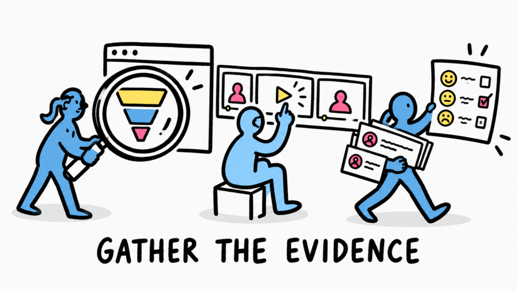
A solid UX audit process starts with evidence. Pull funnel drop-offs from your analytics, watch 15 to 20 session recordings, read the last three months of support tickets and skim churn survey answers. Where the numbers show what is breaking, usability testing with five real users tells you why. Keep every finding tied to a source so no one can dismiss it as taste.
3. Check How Clearly Your Value Comes Across
For SaaS, the experience starts before login. Can a first-time visitor explain what your product does after ten seconds on the homepage? Do different buyers (founders, ops leads, end users) each find a clear path? Check that pricing, feature pages and signup tell one consistent story.
How Brucira Clarified the Story for FunnelStory
FunnelStory, a B2B platform that gives go-to-market teams visibility into product trials and buyer behaviour, had to speak to several audiences with very different goals. Its old site made that hard.
Brucira’s redesign prioritised the essential information for each audience, streamlined navigation and layout, and used custom illustration and iconography to explain a complex data product visually. It’s a reminder that “value clarity” belongs on every SaaS audit, not just in the marketing plan.
4. Audit Onboarding and Time to Value
Map every step from signup to the first “aha” moment and count them. Look for empty states with no guidance, setup tasks that could be deferred, and permission or integration steps that stall new accounts. If users need a sales call to understand the product, your onboarding is doing too little. Note where users drop off in your data and match those screens to this list.
5. Evaluate Navigation and Information Architecture
SaaS products grow feature by feature, and menus rarely keep up. Check whether labels match the words your users actually use, whether key features sit more than three clicks deep, and whether settings are scattered across multiple places. A quick card sort or tree test will expose weak information architecture fast.
How Brucira Restructured the Experience for PingSafe
PingSafe, a cloud security platform, needed to explain a technical product to multiple stakeholders in a sector where trust decides the deal.
Brucira restructured the information architecture and built an intuitive user flow across 18 to 20 pages, then rolled the changes out in phases, starting with the most important pages. Fixing structure first made every later design decision easier.
6. Stress-Test Core Workflows and Forms
Pick the three tasks users do most often and complete each one yourself, timing it. Check form validation, error messages, loading states, bulk actions and undo. Good SaaS UI UX design makes the common path fast and the mistake recoverable. Any error message that blames the user or offers no next step goes straight onto your issue list.
7. Run Heuristic and Accessibility Checks
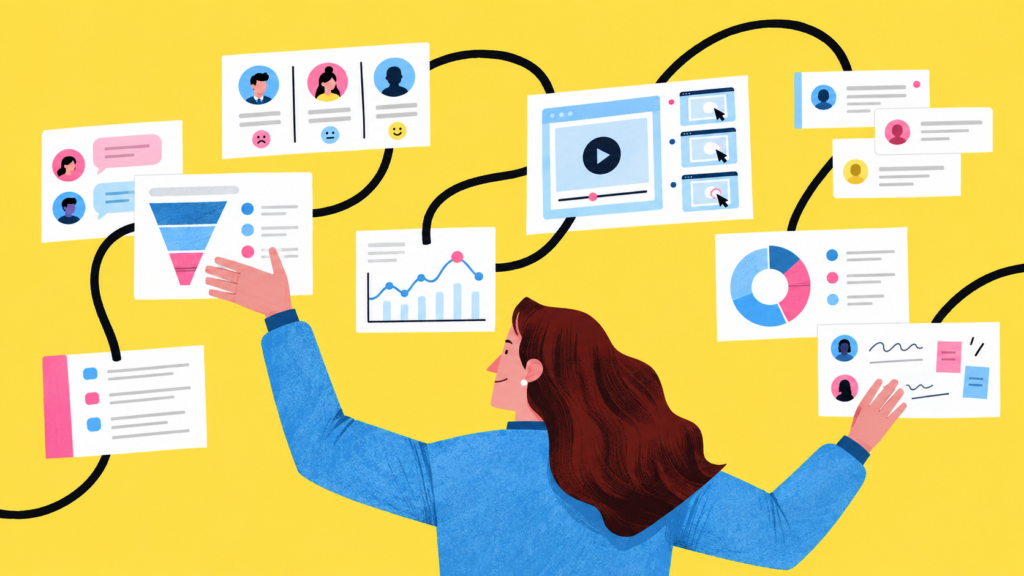
Walk each key screen against Nielsen’s ten heuristics (our heuristic evaluation guide covers this step by step). Then test colour contrast, keyboard navigation, focus states and screen-reader labels. Accessibility issues are often cheap to fix and affect far more users than teams expect.
8. Check Visual and Component Consistency
Screenshot every button, input, table and modal in the product and lay them side by side. Mismatched styles, spacing and patterns quietly erode trust and slow your team down. Inconsistencies here usually point to a missing or outdated design system.
9. Prioritise Findings With a UX Audit Checklist Template
A long list of issues helps no one. Score each finding by severity and effort, then fix high-severity, low-effort items first. Use this UX audit checklist template to log everything in one place:
| Area | Checklist question | Evidence | Severity (1-4) | Effort (S/M/L) | Owner |
|---|---|---|---|---|---|
| Value clarity | Can a new visitor explain the product in 10 seconds? | 5-second test | |||
| Onboarding | How many steps to the first “aha” moment? | Funnel data | |||
| Navigation | Are key features within three clicks? | Tree test | |||
| Workflows | Can users recover from every error? | Session recordings | |||
| Accessibility | Does every screen pass WCAG AA contrast? | Contrast checker | |||
| Consistency | Do components look and behave the same everywhere? | UI inventory |
Before shipping big changes, validate fixes through prototyping and iterative testing so you’re not swapping one problem for another.
Final Thoughts
A UX audit is only as useful as the decisions it drives. Start from a clear goal, back every finding with evidence, and rank fixes by impact. Revisit your UX audit checklist every quarter, since SaaS products change faster than most teams notice.
Have a SaaS product that needs a fresh set of eyes? Reach out to Brucira at hello@brucira.com. For more on product design and UX, explore our blog or see our work.
FAQs
Q1: What is a UX audit checklist?
A UX audit checklist is a structured list of questions used to review a product’s usability, from onboarding and navigation to accessibility and visual consistency. It keeps the review consistent and makes sure no important area gets skipped.
Q2: What are the main steps in a UX audit process?
A typical UX audit process covers setting goals, gathering analytics and user data, reviewing key flows against heuristics, logging issues with evidence, and prioritising fixes by severity and effort. The final output is usually an audit report with recommendations.
Q3: How is a SaaS UX audit different from a website audit?
A SaaS audit goes beyond the marketing site into onboarding, activation, core workflows and retention. Good SaaS UI UX design is judged by how quickly users reach value and keep coming back, not just by first impressions.
Q4: When should I invest in professional UX audit services?
Consider UX audit services when conversion or activation stalls, before a major redesign, or when your team is too close to the product to spot its problems. An outside team brings fresh eyes and a proven framework.
Q5: How often should a SaaS product be audited?
Run a full audit once or twice a year and a lighter UX audit checklist review each quarter or after major releases. Frequent, smaller audits catch friction before it shows up in churn numbers.
Ready to find what’s holding your product back? Get in touch with Brucira.