





Bright colours may attract attention, but louder does not always mean more memorable.
Many brands use muted colours to create calm, sophisticated identities. These shades reduce visual noise and help products feel considered.
The challenge is avoiding a dull result. Here are nine practical tips.
What Are Muted Colours?
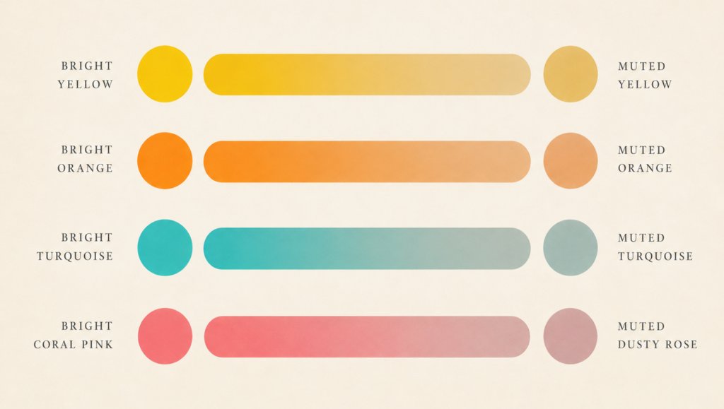
To begin, it helps to understand what are muted colours.
Muted colours are shades with reduced saturation. Designers create them by mixing a bright colour with grey, white, black or its complementary colour.
The muted colours meaning goes beyond neutrality. Depending on the context, muted tones can communicate maturity, comfort, nature, heritage or understated confidence.
1. Begin With the Brand Personality
Colour choices should reflect what the brand needs to communicate.
Soft greens can feel natural, subdued blues stable and dusty red expressive without becoming loud.
Before selecting muted colours, define the audience, positioning and personality. This connects colour to what is visual identity instead of treating it as decoration.
How Brucira Refined Mokobara’s Digital Identity

Mokobara wanted its visual expression to better reflect the thoughtful design and craftsmanship of its travel products. Brucira evolved its digital presence through a cohesive system spanning typography, imagery, layouts and motion.
Reducing visual loudness created a more premium experience, while photography and movement added warmth.
2. Build Around One Dominant Shade
Several low-saturation shades with equal visual weight can make a design feel flat. Choose one dominant colour for prominent areas and use secondary shades to organise content.
This creates hierarchy while preserving the character of muted colours.
3. Add Contrast Through Light and Dark Values
A restrained palette still needs contrast.
Pair dusty blue with navy, or pale clay with dark brown. Different values make headings, buttons and key information easier to notice.
When using muted tones online, check contrast carefully. An elegant palette fails when users cannot read text or identify actions.
Review the palette on different screens and in both light and dark environments. Colours can shift across devices, while surrounding content changes how a shade is perceived. Realistic testing prevents unexpected results after launch.
4. Combine Muted Shades With Neutrals
A neutral colour palette gives softer shades breathing room.
Warm white, charcoal, beige and soft grey allow muted colours to stay distinctive. They also improve readability on content-heavy pages.
They should support colour, not make the entire brand look beige.
How Brucira Balanced Colour for Plum Goodness
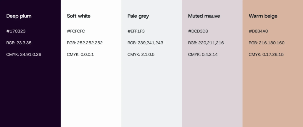


Plum Goodness needed a digital experience that balanced science-backed skincare with natural ingredients.
Brucira softened the brand’s core colours with neutral tones, supported by clear typography and subtle motion. The result felt premium, cohesive and expressive without becoming visually overwhelming.
5. Reserve Brighter Colours for Important Actions
A restrained system becomes more effective when bright accents are used selectively.
A vivid button or label stands out against muted colours, directing users without competing signals.
Use accents for meaningful actions. When everything demands attention, nothing receives it.
6. Consider the Emotional Meaning of Each Shade
Softened colours still communicate different ideas.
Sage can feel natural. Dusty pink may feel warm or nostalgic. Slate blue can suggest reliability, while terracotta feels grounded and human.
The muted colours meaning changes with typography, imagery, industry and cultural context. Test the complete system rather than assuming one shade creates the same response everywhere.
7. Use Texture, Photography and Illustration
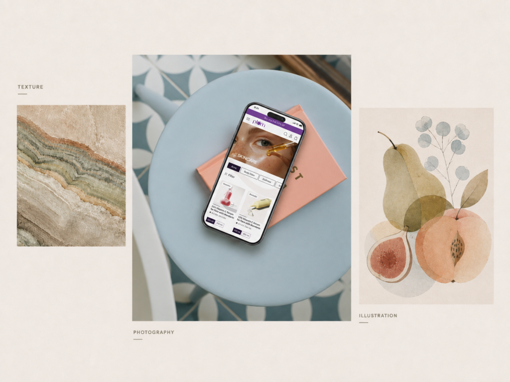
As muted colours have lower intensity, supporting elements can add richness.
Natural textures, subtle gradients, editorial photography and simple illustration can prevent the palette from feeling empty. They should share a similar visual temperature so the brand remains cohesive.
Avoid placing detailed imagery behind important text. Depth should support communication, not reduce clarity.
8. Test the Palette Across Real Touchpoints
A palette should work beyond a presentation slide.
Apply muted colours to websites, social posts, packaging and mobile interfaces. A sophisticated background shade may become unclear in small text.
Testing real applications reveals whether the system has enough contrast, flexibility and recognition.
9. Document Clear Usage Rules
Consistency turns a collection of colours into an identity.
Brand guidelines should define primary and secondary shades, background combinations, text colours, accessibility requirements and approved accents. They should also show what to avoid.
Clear rules help teams use muted colours without gradually changing the brand’s character.
Final Thoughts
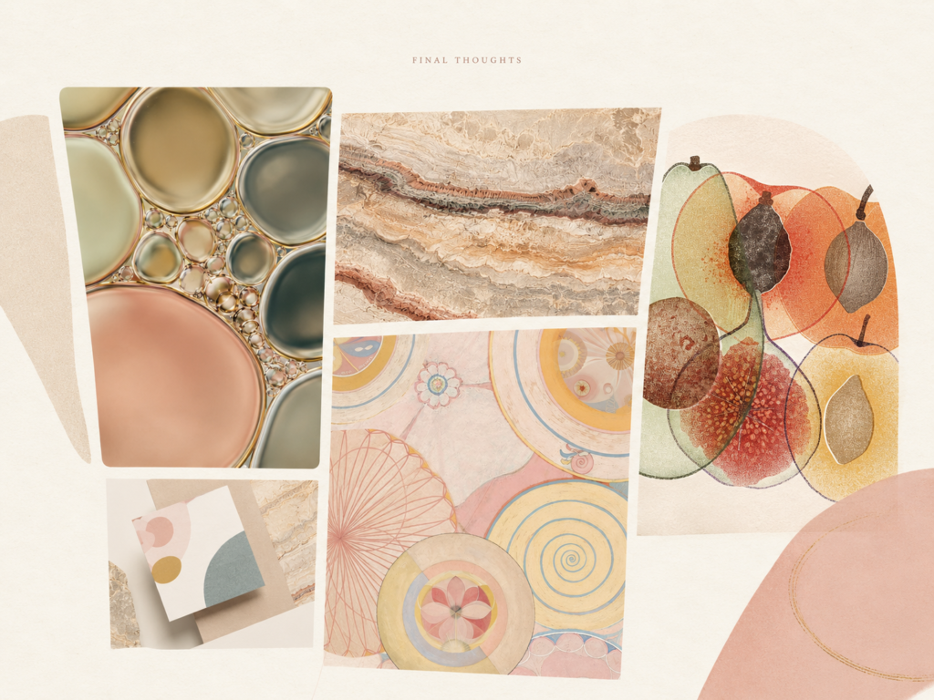
Muted colours can help a brand feel calm, premium and distinctive, but subtlety still requires structure.
Start with strategy, create contrast, use neutrals intentionally and test the palette across real applications. When muted colours work with typography, imagery, layout and motion, they become a meaningful part of visual identity.
Have a branding or website project in mind? Reach out to Brucira at hello@brucira.com.
Want more design insights? Explore the Brucira blog and portfolio.
FAQs
Q1: What are muted colours?
Muted colours are shades with lower saturation or intensity. They are usually created by adding grey, white, black or a complementary shade to a brighter colour. This gives them a softer and more restrained appearance.
Q2: What do muted colours mean in branding?
The muted colours meaning depends on the brand and context. They can communicate calmness, maturity, warmth, trust, heritage or understated luxury. Brucira can help determine whether these qualities align with your brand positioning.
Q3: What is the difference between muted tones and neutral colours?
Muted tones can include softened versions of almost any colour, such as dusty blue, sage green or faded pink. A neutral colour palette usually focuses on shades such as white, beige, grey, brown and black.
Q4: Can muted colours work in web design?
Yes. Muted colours can make websites feel sophisticated, approachable and easier to navigate. However, they must be combined with sufficient contrast so that text, buttons and other interface elements remain accessible.
Q5: How do colours contribute to visual identity?
Understanding what is visual identity involves looking at how colour, typography, imagery, layout, illustration and motion work together. Colour helps establish recognition and emotional tone, but it should support a complete brand system.
Need help creating a distinctive colour system for your brand or website? Contact Brucira to explore branding, visual identity and web design solutions.