





Most products don’t fail because of bad code. They fail because users can’t tell what to look at first, where to tap next, or why a screen feels cluttered. Getting UI UX design best practices right starts with spotting the common UI design mistakes to avoid before they ship. Below are 12 of the biggest offenders, drawn from real audits, and how fixing each one restores visual hierarchy and usability.
1. No Clear Visual Hierarchy
When every element competes for attention, the eye has nowhere to land. Size, weight, color and spacing should work together to signal what matters most. Studying visual hierarchy in UI design examples from products you admire is a fast way to see this in action: the primary action is always unmistakable, and secondary content recedes.
How Brucira Designed Clear Hierarchy Into EasyA’s Student App
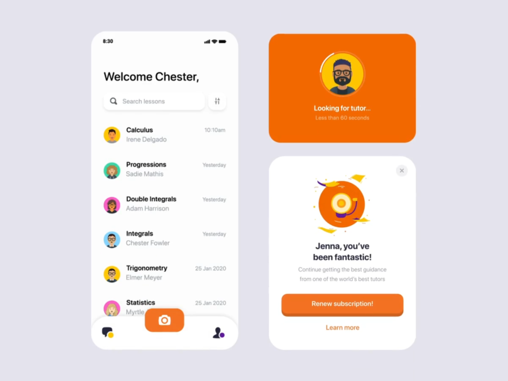
EasyA, a London-based tutoring platform, needed students to move confidently through a single core flow: upload a question, get matched with a tutor, complete the lesson. Brucira mapped that workflow first, then layered in a deliberate color and illustration system so each step read as the obvious next one, rather than one option among many.
Students and the client both called out the app’s visual and functional appeal. That’s what a working hierarchy looks like in practice: the interface disappears and the task takes over.
2. Overcrowded Layouts With No Breathing Room
Cramming every feature onto one screen is one of the most common UI design mistakes to avoid. White space isn’t wasted space, it’s what lets the important elements breathe and be found quickly. Bad UI design examples almost always share this trait: dense, competing content with no visual pause.
3. Inconsistent Typography Scale
If headings, body copy and labels don’t follow a predictable size and weight system, users lose the cues that tell them what’s a title versus a footnote. A disciplined typography scale, tied to a broader design system, is one of the simplest UI UX design best practices for restoring order fast.
4. Weak Color Contrast
Low-contrast text and buttons look sleek in a mockup but fail the moment real users, in real lighting, on real screens, try to read them. Contrast is a functional tool for hierarchy, not just a stylistic choice, and skimping on it undermines usability for a large share of your audience.
5. Competing Calls-to-Action
A screen with three buttons of equal visual weight leaves users guessing which one matters. Hierarchy means committing to one primary action per screen, with secondary options styled to look clearly secondary.
6. Ignoring Alignment and Grids
Elements that don’t line up on a consistent grid create subtle visual noise, even when users can’t articulate why a screen “feels off.” Grids give structure that supports scanning and comprehension.
7. Inconsistent Spacing and Padding
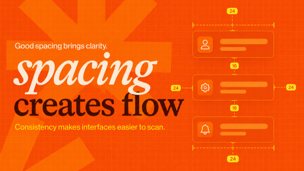
Uneven margins between similar elements break the rhythm that helps users group related content mentally. Consistent spacing is invisible when done right and distracting when it isn’t.
8. Confusing Navigation Labels
Vague labels like “Explore” or “More” force users to click just to find out what’s behind them, which quietly erodes trust in the whole interface. Fixing this is rarely about wording alone. It usually means rethinking the information architecture behind the labels, so the structure itself communicates what each section contains.
9. Decoration Over Function
Illustrations, animations and gradients are wonderful, until they outrank the content they’re meant to support. Decorative elements should reinforce hierarchy, not compete with it for the user’s attention.
How Brucira Made Decoration Work Harder for DHL

DHL’s brand refresh, led by Brucira, needed a custom illustration and animation system for sales collateral and a responsive internal site. Instead of treating illustration as decoration, the team built it into the hierarchy itself, guiding attention toward key information. Sales collateral usage grew 55% as a result.
The lesson holds for any UI: decoration earns its place only when it directs the eye somewhere useful.
10. Ignoring Mobile Hierarchy
A layout that reads clearly on a large desktop screen can collapse into a wall of equally weighted elements on mobile. Hierarchy has to be rebuilt, not just resized, for smaller viewports.
11. Neglecting Accessibility Basics
Tiny tap targets, low contrast and unlabeled icons don’t just fail accessibility audits, they fail ordinary users on ordinary days. Accessible design and strong visual hierarchy are the same discipline viewed from two angles.
12. Skipping Usability Testing
Teams often ship their best guess at a hierarchy and never watch a real person try to use it. Running prototyping and iterative testing before launch catches hierarchy and usability problems while they’re still cheap to fix. It’s one of the UI UX design best practices that’s easy to skip under deadline pressure and expensive to skip in hindsight.
Final Thoughts
Most of these 12 problems trace back to the same root cause: hierarchy that was designed by instinct instead of tested with real users. Fixing even a handful of them, starting with contrast, spacing and a single clear call-to-action per screen, makes a measurable difference in how usable a product feels.
Have a UI or UX project in mind? Reach out to Brucira at hello@brucira.com. Browse more insights on the Brucira blog or see our work at brucira.com/work.
FAQs
Q1: What are the most common UI design mistakes to avoid?
The most frequent ones are weak visual hierarchy, overcrowded layouts, inconsistent typography, low color contrast and competing calls-to-action. Each of these makes it harder for users to know where to look first, which is usually the real cost of poor usability.
Q2: What is visual hierarchy in UI design, and why does it matter?
Visual hierarchy is the intentional arrangement of size, color, contrast and spacing to guide the eye through a screen in order of importance. Strong visual hierarchy examples always make the primary action obvious within seconds, without the user having to think about it.
Q3: How can I spot bad UI design examples in my own product?
Look for screens with more than one dominant call-to-action, dense layouts with no white space, or text that’s hard to read against its background. If a new user needs a walkthrough to understand a screen, that’s usually a visual hierarchy problem, not a content problem.
Q4: Are UI UX design best practices different for mobile versus desktop?
The core principles stay the same, but hierarchy has to be rebuilt for each screen size rather than simply scaled down. What reads clearly with room to breathe on desktop can flatten into competing elements on a small mobile viewport.
Q5: How often should usability testing happen during a redesign?
Ideally at every major milestone, not just at the end. Testing early prototypes catches hierarchy and usability problems while they’re still cheap to fix, rather than after a full build.
Have a project you’d like a second opinion on? Get in touch with Brucira.