





Most products don’t lose users in month three. They lose them in the first five minutes. A UX audit of your onboarding flow shows exactly where new users hesitate, get confused or quietly leave. Use this UX audit checklist to review every step from sign-up to first value.
1. Define What “Activated” Means Before You Audit
You can’t fix an onboarding flow until you know where it should end. Pick one moment that signals a user has found real value: a first transfer sent, a first project created, a first policy uploaded. Every screen in your onboarding should move people toward that moment. Start the UX audit by mapping the current path from download to activation and counting the steps. If you can’t name the finish line, your users can’t find it either.
2. Count Every Field and Question
Each form field is a small tax on motivation. Go through sign-up and list every input you ask for, then mark which ones are needed right now and which could wait until later. Phone number, company size, job title and preferences often belong after activation, not before it. A good UX audit checklist treats every extra field as guilty until proven necessary.
How Brucira rethought onboarding for CoverSure
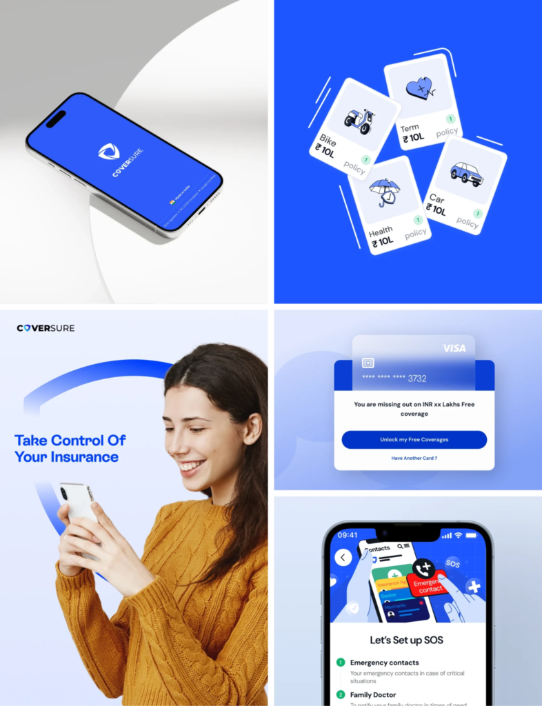
When CoverSure asked us to redesign its insurance management app, we started with a quick UX audit of the existing product to find inefficiencies in flows, UI patterns and hierarchy.
That review led us to rethink the onboarding flow entirely. Instead of asking users to type out policy details, new users could upload documents straight from Google Drive, DigiLocker or a PDF. Fewer manual inputs, faster setup, and a much clearer path to the single dashboard where users see all their policies.
3. Check That the First Screen Earns Trust

New users decide in seconds whether your product looks credible. Review your first screens for a clear value statement, a visual style that matches your brand and no jargon. In fintech, healthcare and insurance, trust signals like security badges and regulatory mentions matter even more. Our guide on running a heuristic evaluation covers the usability principles worth checking here.
4. Review Your App Onboarding Screens for Skippability
Welcome carousels are the most skipped part of most apps. Audit your app onboarding screens and ask whether each one teaches something the user can’t learn by simply using the product. If not, cut it. Where an explanation is genuinely needed, show it in context at the moment the user meets that feature, rather than front-loading five slides before anyone has tapped a button.
5. Test Verification and KYC Steps Separately
Identity checks, OTPs, email confirmation and document uploads are where onboarding flows break most often. Treat them as their own mini UX audit. Check what happens when an OTP expires, a camera permission is denied or an upload fails. Every error needs a plain-language message and a clear way back. Users should never have to restart the whole flow because one step failed.
How Brucira designed first interactions for BharatPe
For BharatPe, the goal was to build trust from the very first interaction for users with very different levels of digital familiarity, including many in Tier 2 and Tier 3 cities.
We reduced cognitive load by showing only what was essential on each screen and keeping deeper information one step away. Micro-interactions and transitions guided attention through steps like Aadhaar verification and submitting details to the bank, and helped reduce perceived loading times. Several of these flows went live in the product.
6. Give Feedback at Every Step
Silence makes users anxious. Audit every action in onboarding and check that it produces a visible response: a loading state, a success confirmation, a progress indicator. Users who know they’re on step two of four are far more likely to finish than users who can’t tell how much is left. Progress bars, checkmarks and short confirmation messages are cheap to build and pay off quickly.
7. Audit the Empty States
The screen a user sees right after sign-up is often an empty dashboard. That’s a missed opportunity. Review every empty state in your product and replace blank space with a next step: a sample project, a short prompt or a single clear call to action. An empty state should answer one question: what do I do now?
8. Check the Flow on Real Devices and Slow Networks
An onboarding flow that feels smooth on a designer’s laptop can fall apart on a mid-range phone over a patchy connection. Test on real devices, low-end hardware and throttled networks. Watch for keyboards covering input fields, buttons below the fold and screens that time out. This step is especially important for products serving users across India and the UK, where device and network quality vary widely. Make device testing a standard part of every UX audit, not an afterthought.
9. Measure Drop-Off and Retest After Every Change

A UX audit isn’t a one-time exercise. Set up funnel tracking for each onboarding step so you can see exactly where users leave, then retest after each fix. Small, frequent changes backed by data beat a big redesign every two years. If you want structured support, our prototyping and iterative testing team can validate changes with real users before you ship them.
Final Thoughts
Onboarding is the most valuable real estate in your product. Define your activation moment, cut unnecessary inputs, earn trust early, handle errors gracefully and keep measuring. Run through this UX audit checklist every quarter, or whenever activation dips, and you’ll catch friction before it costs you users.
Looking for UX audit services for your onboarding flow? Reach out to Brucira at hello@brucira.com. You can explore more design insights on our blog and see our work at brucira.com/work.
FAQs
Q1: What is a UX audit?
A UX audit is a structured review of a digital product to find usability problems that slow users down or cause them to leave. It combines heuristic evaluation, analytics, flow mapping and sometimes user testing. The output is a prioritised list of fixes tied to business goals like activation and conversion.
Q2: What should a UX audit checklist for onboarding include?
A strong UX audit checklist for onboarding covers your activation definition, form fields, first-screen trust signals, app onboarding screens, verification steps, feedback states, empty states, device testing and drop-off tracking. Each item should be checked against real user behaviour, not just design opinion.
Q3: How do I know if my onboarding flow needs an audit?
Common signs include low activation rates, high drop-off between sign-up and first use, frequent support tickets from new users and poor app store reviews mentioning confusion. If you’ve added features without revisiting your onboarding flow, it’s likely due for a review.
Q4: Should I hire a UX audit agency or do it in-house?
In-house teams know the product deeply but can be too close to spot friction. A UX audit agency brings fresh eyes, cross-industry patterns and a structured process. Many teams combine both: an external audit to find the issues, then in-house iteration to fix them. Brucira offers UX audit services as part of its product strategy work.
Q5: How long do UX audit services usually take?
For a focused onboarding flow, UX audit services typically take two to four weeks, depending on the number of flows, platforms and whether user testing is included. Larger products with multiple user types can take longer. The key is ending with clear, prioritised recommendations rather than a long list of issues.
Ready to turn more sign-ups into active users? Talk to Brucira’s team about auditing your onboarding flow.